Stories LA is an independent bookstore, gift shop and cafe located in Echo Park, Los Angeles, California.
Echo Park’s stalwart supplier of books and coffee, we gots beer, wine and food, both
savory and sweet. The quintessential home for quotidian transgressions.
When we started working on the stories website, we really wanted to honor their style, and cater to their eclectic regulars, as well as entice new customers to browse. The site’s issues were browsing, general functionality, and design, so we felt that if we fixed those three items, we would be closer to achieving the goal.
To further our research, we developed an interview script and interviewed users to find out more about their habits and motivations when purchasing books.
After the user research was conducted, we synthesized the data by using an affinity map. The goal was to look for patterns and themes across multiple users.
Then, giving him a scenario, we had Bobby browse the Stories website as it currently stands.
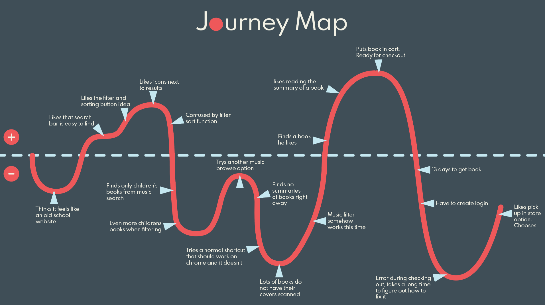
We documented the ups and downs of this browsing and checkout process using a Journey Map, along with the other evaluations, this also helped us discover where users where having points of friction while using the site.

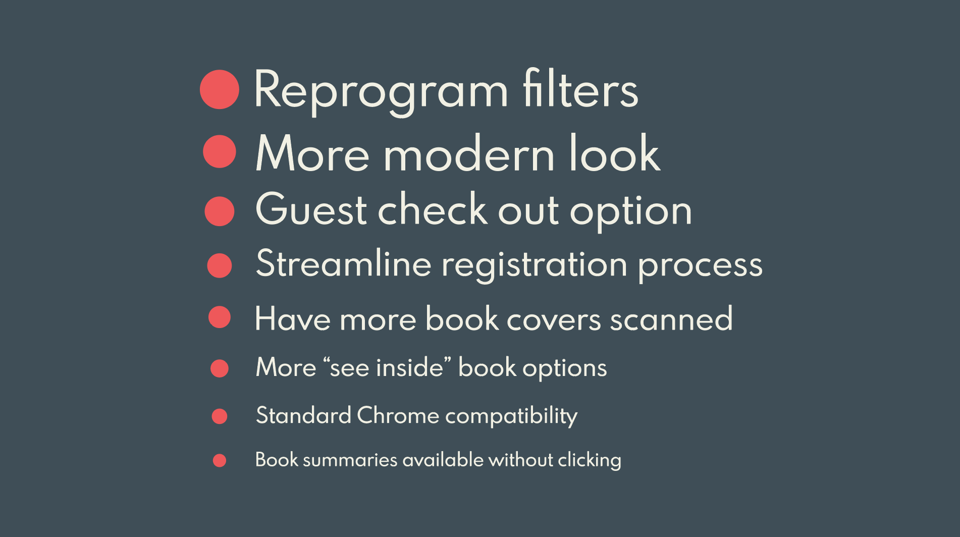
We developed a problem statement to continue to narrow our focus and provide recommendations for improving the site.
All of our research culminated with making recommendations for improving the site. We were then able to implement the recommendations with further research. We used these recommendations in order to set new goals going forward.

In order to build a better website, we had to first see what current functionality we were working with. We built a sitemap to see what kind of navigation was currently on the website. A sitemap gives you an impression of the website’s overall architecture. We included Global, main, and side navigation, as well as footers. We also indicated when a link showed up only when logged in.
We wanted to test real users to see where they intuitively thought the navigation elements should be placed, so we did a card sort. We found that users grouped elements like email, contact and newsletter together, and gifts, gift certificates, toys, and greeting cards together. The home button, shopping cart, and login button were also generally placed in the same order and location.
From these card sorts and our own intuition we set out to build a new and improved sitemap. We scaled down the top navigation to only essentials such as cafe, events and contact. We took away anything that would deliver a fractured shopping experience such as Ebay.com and Bookmanager. We also added a section for special order books, and will be taking any book that takes longer than 13 days to receive out of the top navigation.
We wanted to give Bobby another opportunity to use the revamped site, so we created another scenario for him:
See if Bobby wins his girlfriend back here:
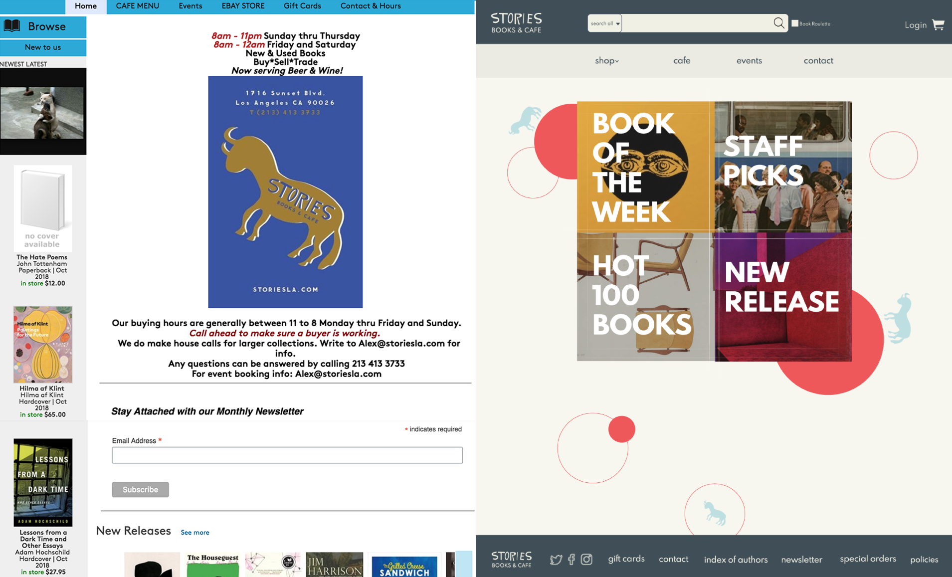
Before
After

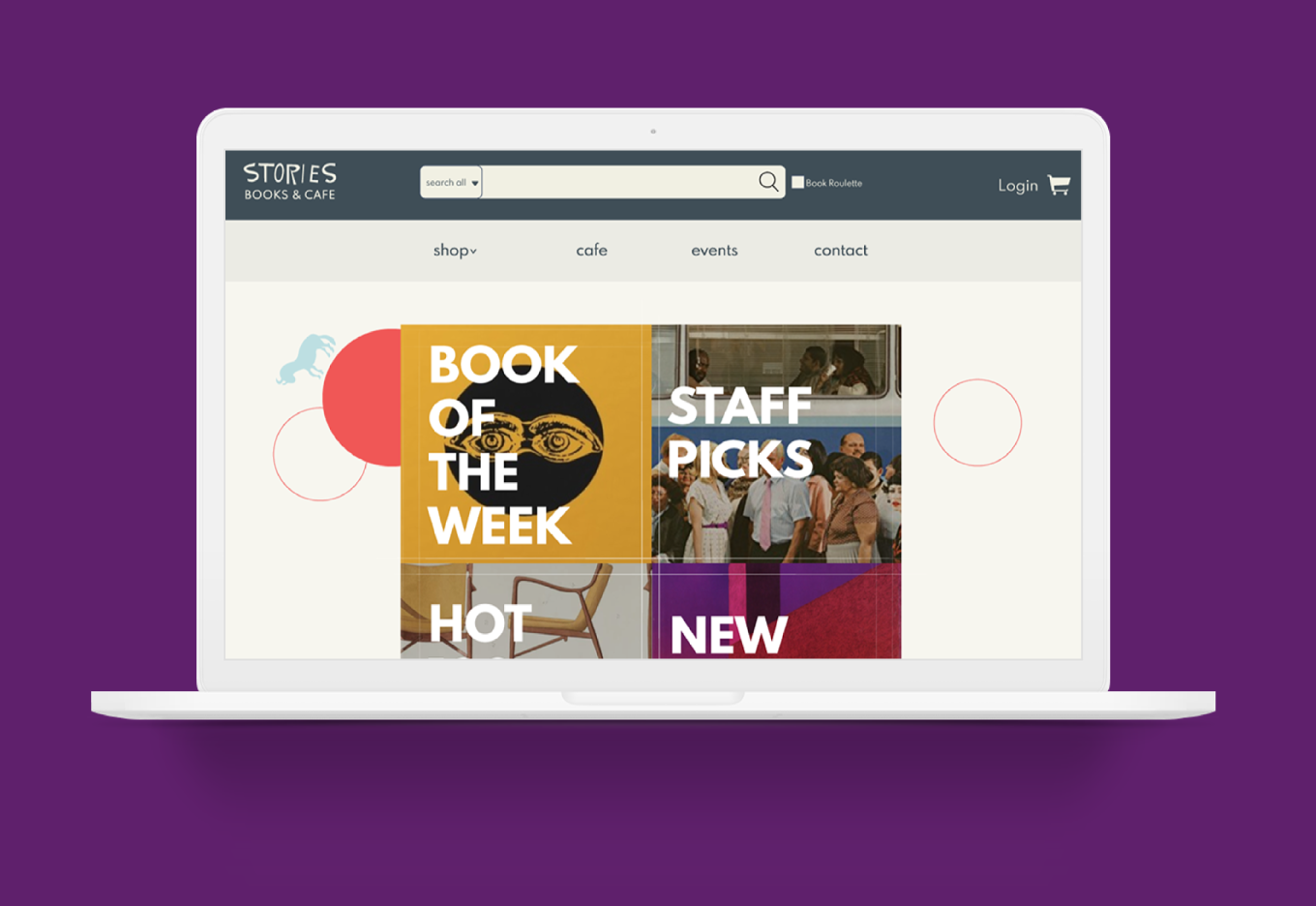
As you noticed in the prototype, the visual redesign of the site was a big component. Stories LA is an independent bookstore in the heart of Los Angeles. They are not like Barnes & Noble or Amazon. They have heart, character, regular customers, and quirky employees. They’re a safe space for those who wants to come in and join the literary community. They’re a place to sit and drink coffee or beer with friends. We wanted to represent that in the website redesign. We also wanted to mimic the in store browsing experience. My research showed that once in a bookstore, users liked to browse for a few hours. Making the site an enjoyable, frictionless experience was is what we hoped we achieved.