

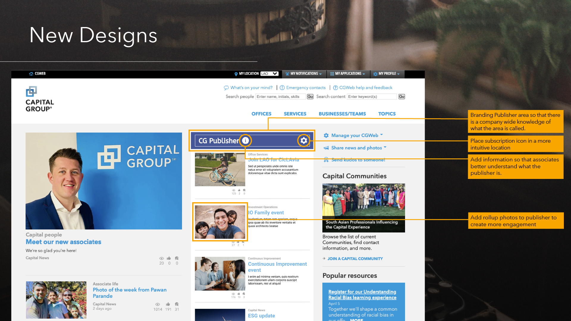
The CGweb Publisher receives only half of the engagement as the main news feed.
Make interface more intuitive, add photos, create community
Remains to be seen, but higher engagement rates are expected.
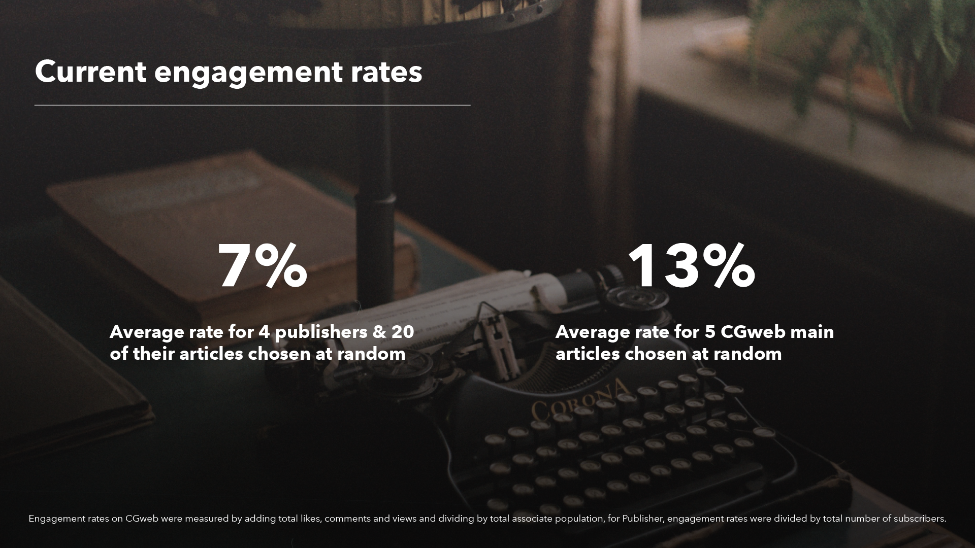
CGweb consists of a main feed which provides company wide news, and is written by our department’s editors. The Publisher feed consists of shorter articles, and announcements written by niche groups within the enterprise. Both are on the main page of our intranet site, yet the Publisher feed gets roughly half the engagement of the main newsfeed.
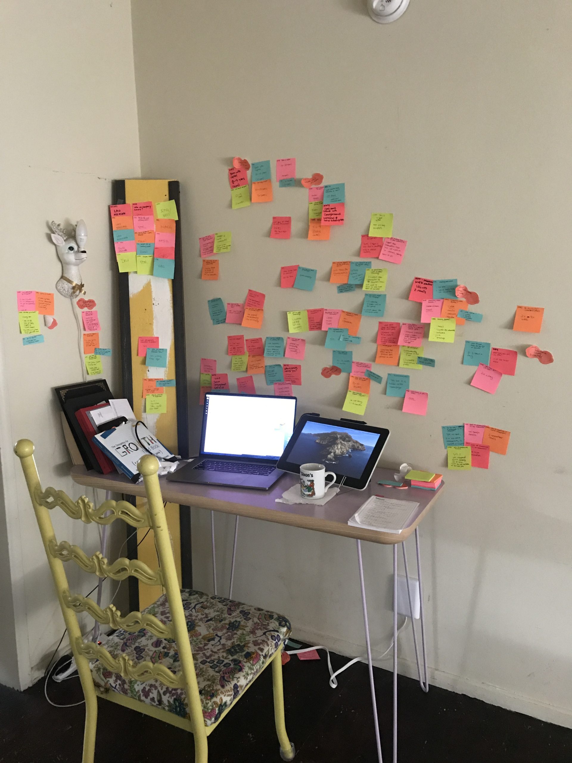
Because I work so closely with CGweb, it was important to interview associates who had no in depth association with the site. It was very helpful to understand an “outsider’s” perspective. The pull quotes below were very telling.
After interviewing associates, I used affinity mapping to find similar themes among users.
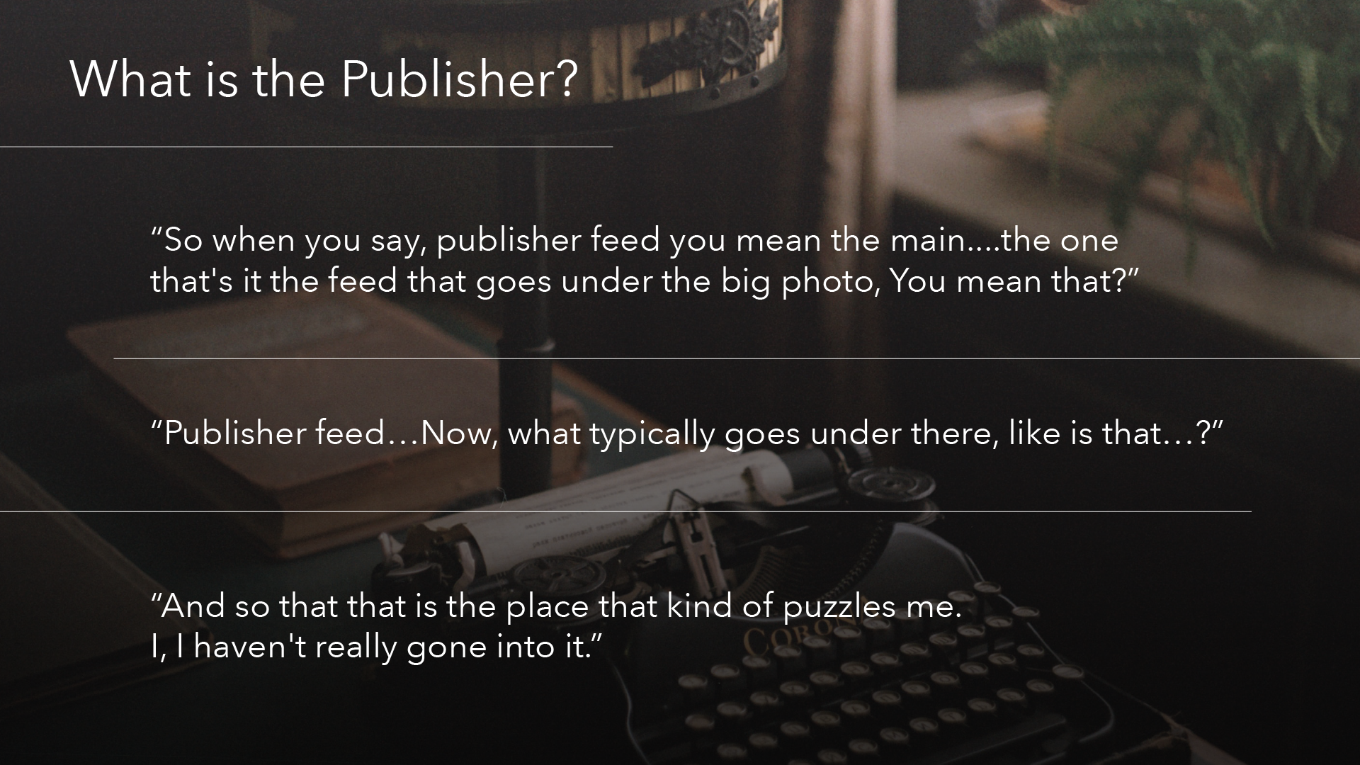
Insight 1: New and old associates alike exhibited confusion when I mentioned the word “publisher.” Although they see the feed every time they visit CGweb, they didn’t know that is what it is called.
Insight 2: Although all associates felt that it was easy to subscribe and unsubscribe to publisher items, no one could remember off of the top of their heads how to do it. New associates had no idea how to do it, or that the items that they saw in the publisher were controlled by a subscription process.
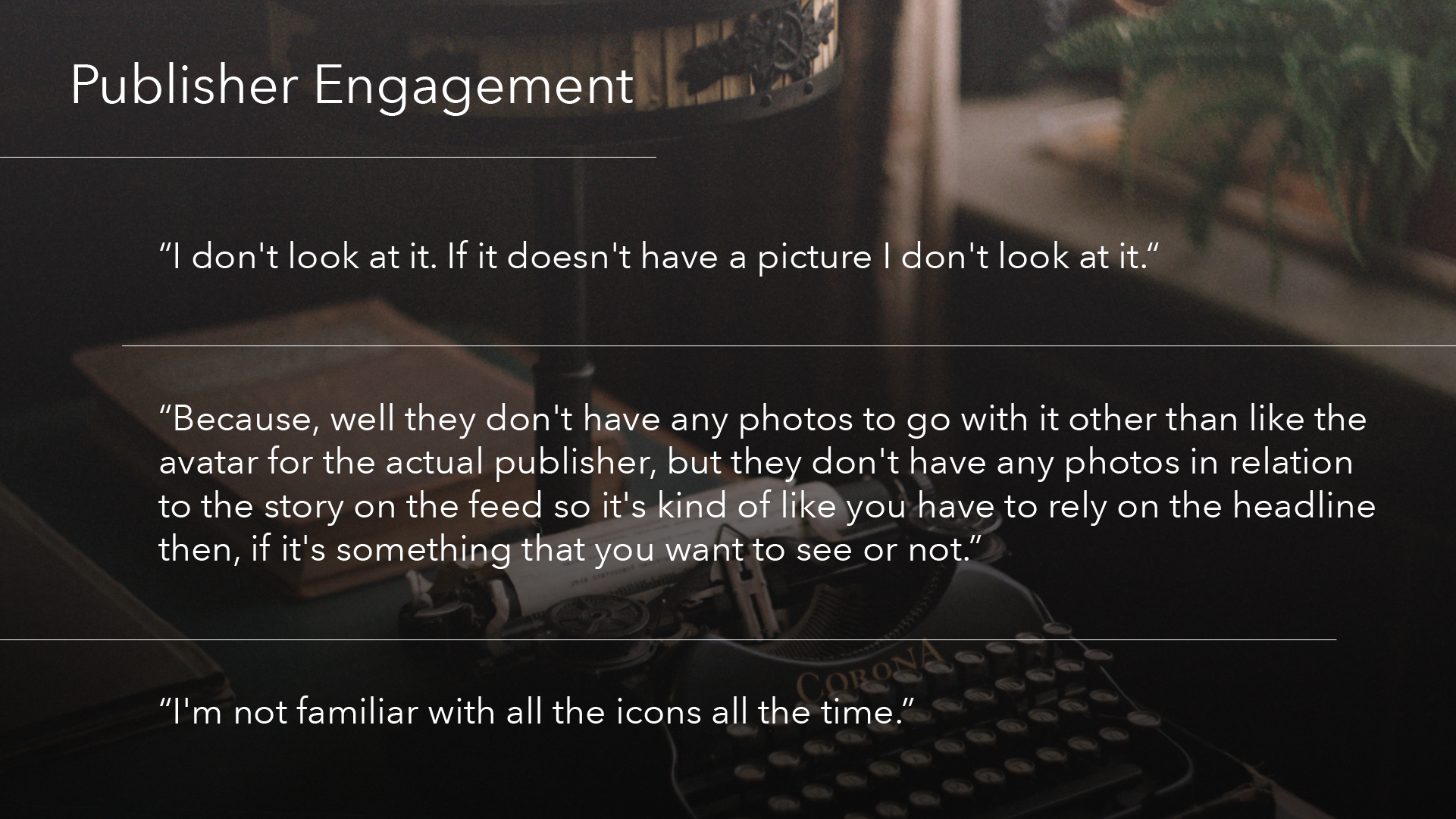
Insight 3: Some associates noted that a reason why they would click on a publisher item would be if the headline caught their eye, and went on to mention that that would be the only thing they’re able rely on, as there are no pictures to compliment the headline.
Insight 4: Nearly all associates consumed news online and on their phone, as opposed to other sources like TV or radio.
Insight 5: Many associates, new and old, used CGweb often, but primarily as an “intermediary” to get to somewhere else: to look someone up, to log their time, or to perform special functions.
However, “I’m too busy” was a common sentiment when asked if an associate spent time reading articles and Publisher feed items on CGweb.
Pandemic Office
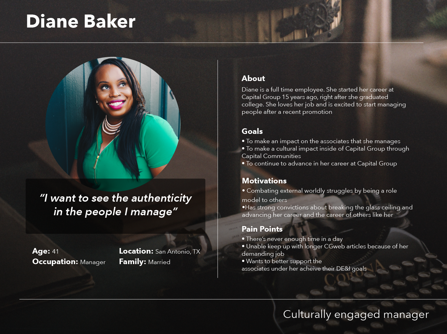
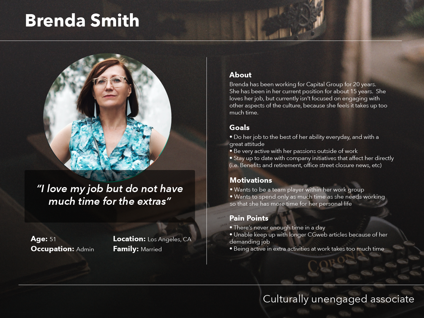
An insight gained from user interviews was that there were two main types of associates: culturally engaged and culturally disengaged.
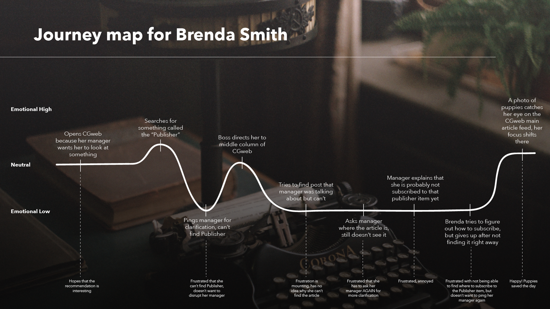
In order to better empathize with the user, I created a journey map. This was created using an amalgamation of several user flow tests.
An insight that was uncovered during our user interviews in our study of CGweb, Capital Group’s intranet site, was that associates generally consume news on their phones. Because of this, it only makes sense that CGweb should have a mobile experience that would align with what associates are doing outside of work.
CGweb is a robust application that empowers associates to not only engage with Capital’s culture, but also do important things like log their time, adjust their benefits and compensation, and plan travel. While the desktop version has all of these functions, we will initially try for more of an MVP approach to the mobile app.
STREAMLINED NAVIGATION
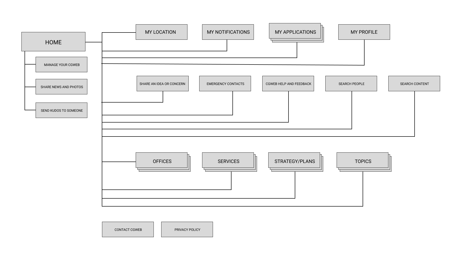
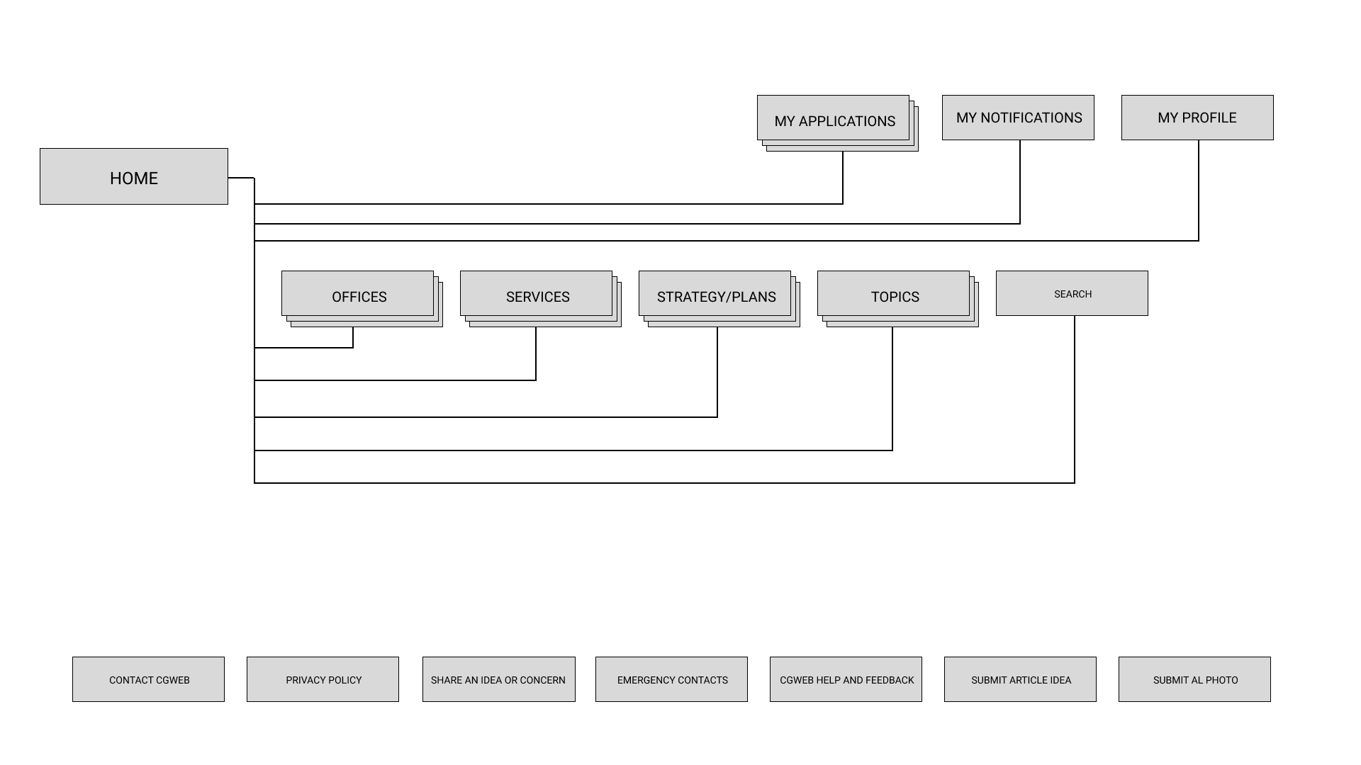
Before I could start working on the mobile experience, I had to streamline the navigation. There were a lot of redundant navigational elements on the desktop version, and elements that were at the top level nav that could have been placed in a footer.
Old sitemap
New sitemap
LOW FIDELITY WIREFRAMING
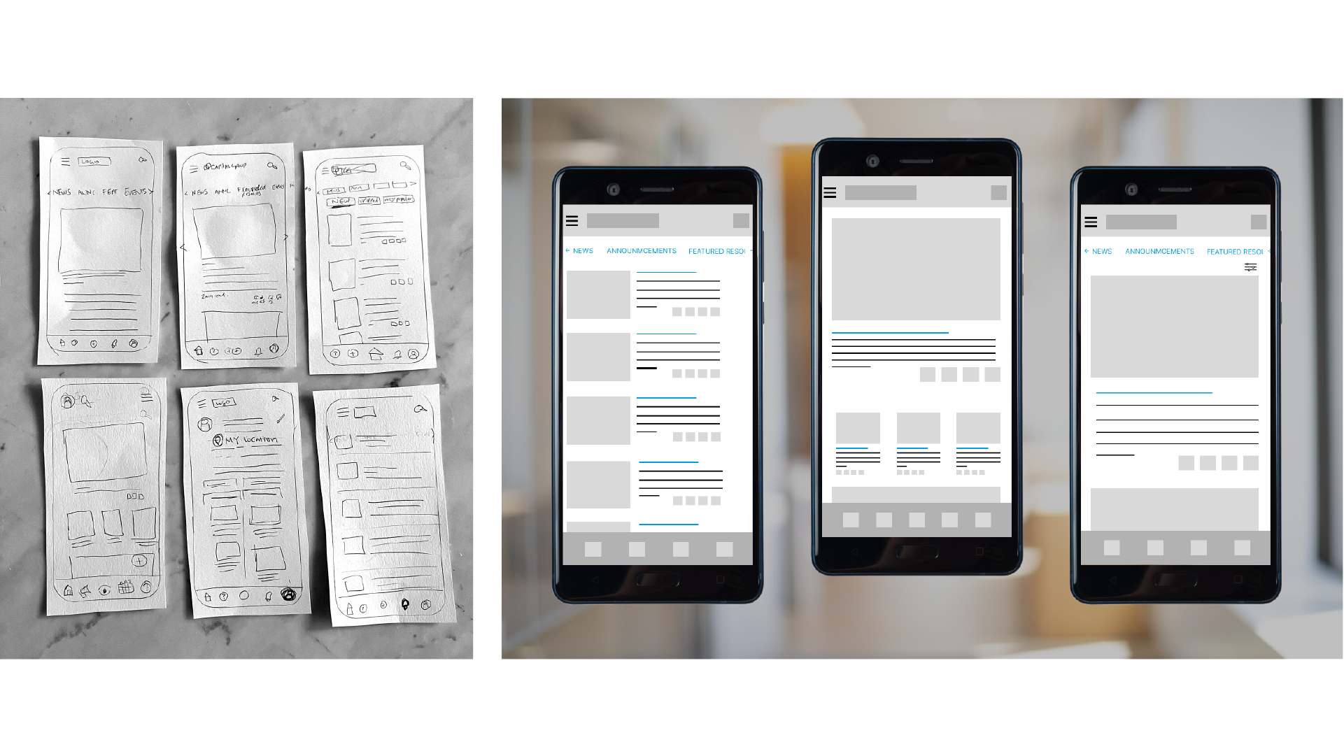
HIGH FIDELITY PROTOTYPING
Developers to implement suggested UI/UX changes for more intuitive userflow, including adding pictures to accompany headlines, changing location of the subscribe buttons, and adding the Publisher title and information icon to the feed.
Capital Group should consider a mobile app for daily news, as research shows that associates prefer to consume news in this manner.
Consider UI strategies for associates who are “too busy” to consume news on CGweb such as adding read time, and making it easier for associates to listen to articles instead of read them. Also consider promoting CGweb news through emails and web banners for more engagement.