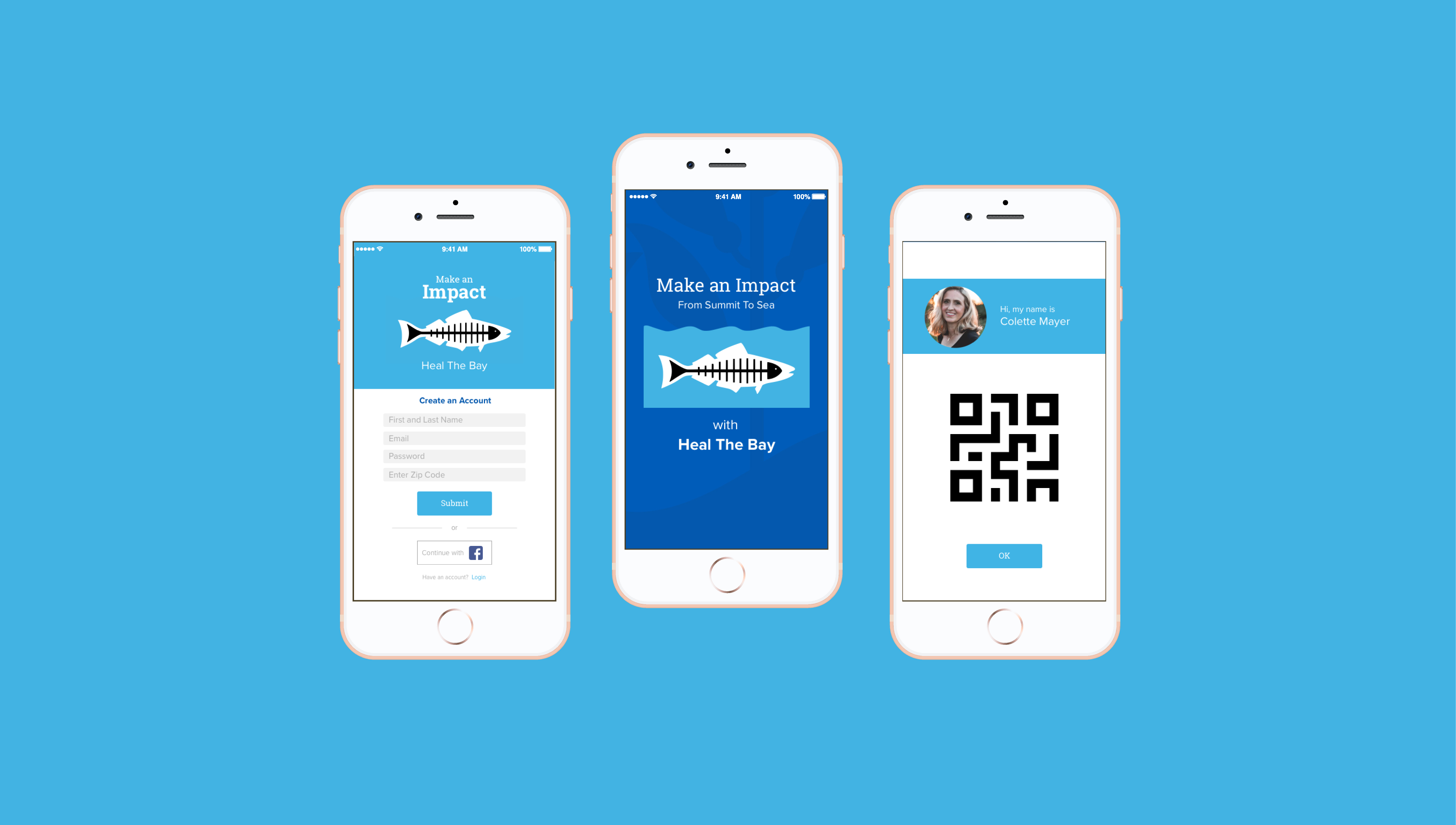
Heal the Bay wants to increase the number of volunteers and to challenge them to collect more garbage than ever before.
Make cleaning trash fun! Increase social satisfaction and accountability by adding a social network on the app. Make events easy to find and RSVP to.
A mobile app that provides a network of volunteers with an event calendar and a fun game to play while cleaning the beach.

In our research, there was only one app that we found that encompassed volunteerism. This tells us that making it easier and more fun to volunteer through emerging technology can change the face of the non profit industry in ways that aren’t even thought of yet. We had an idea that making the app social would get more people involved,
making it competitive would help gather more trash, and having a calendar would enable people to easily find and RSVP to events. No one organization was doing all of these things, so we looked at three different organizations for different aspects of their systems. We also looked at the Heal the Bay website, to see what the current functionality was there.
We conducted interviews of random users along the Santa Monica Pier. From those interviews, we created an affinity map to see if there was any convergence of thought or habits among users.
It was important for us to get to the bottom of the motivations behind volunteerism, so we did research and found results and statistics from previous studies. This was also important in guiding our app’s features.
Our affinity mapping and research told us that our user would be eco friendly, would love to socialize at events by making new friends and taking old ones with them to volunteer, and thought it was important that their children volunteer as well.
We spent a lot of time defining the scope of the project. Because of our limited time, we wanted to make sure that we nailed the features going into the app. A Feature Prioritization really helped visualize what was needed.
We also developed a Problem Statement which helped guide our scope in the context of human centered design.
We then attempted to sketch out our prototype on paper.
Since the userflow had many steps, we thought it best to prototype it in high fidelity for our usability tests. This proved to be the best option.
With our user flow tested, and feedback from our users, we were able to make the necessary changes and then release the prototype on a wider scale.

I thought it was interesting that volunteering apps weren’t more ubiquitous. I think that although it could be a funding issue, it also may reflect who we are as a society and what we value. I also think that nonprofits should look into app creation as a way to modernize their procedures and bring a new generation into volunteering.
Many experiences are going mobile, therefore, businesses and organizations need to adapt to fit the needs of the people they want to attract.