Lipslut.com Prototype
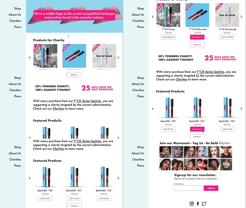
A hero image was added to get people excited. A strong image to relays a strong brand message.

We revised the navigation, added more product on the homepage, and added social media integration.
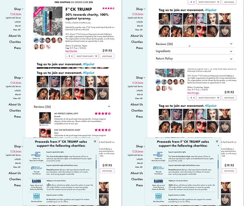
We added reviews for customer trust and community, and more information on charities before checkout.
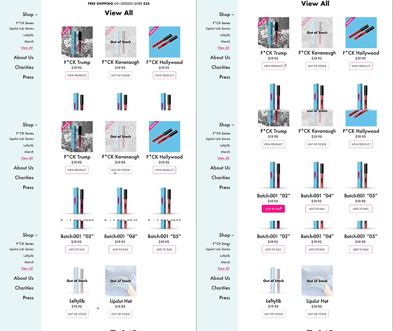
Users told us they wanted to see all items on one page.
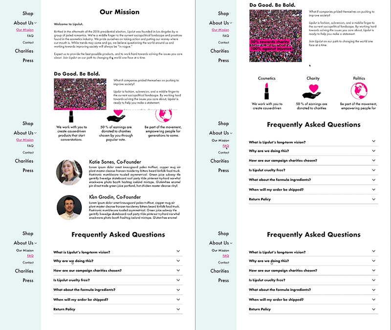
Having Lipslut’s mission and information on co-founders Ken and Katie was important for gaining trust with their customers.
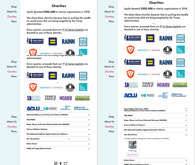
We added info about Lipslut’s charities. Knowing more about the charities creates trust and causes less friction.
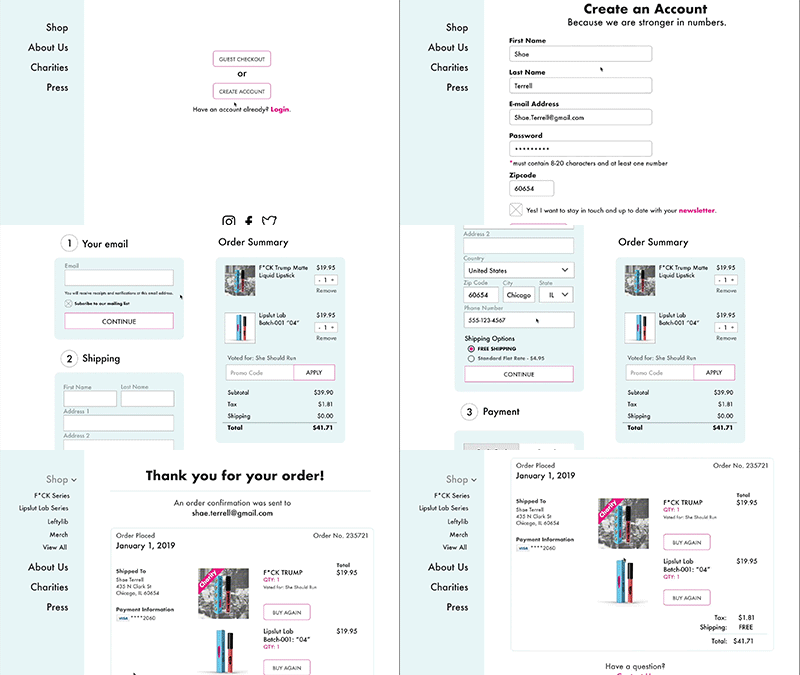
We created the ability for customers to create an account.
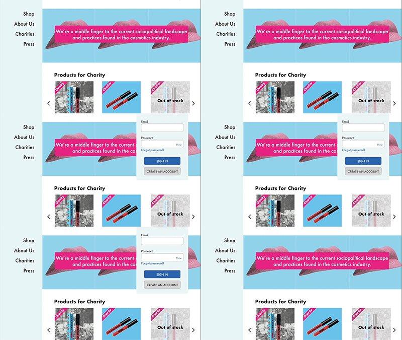
We revised the checkout flow to include adding an account instead of solely guest checkout.
