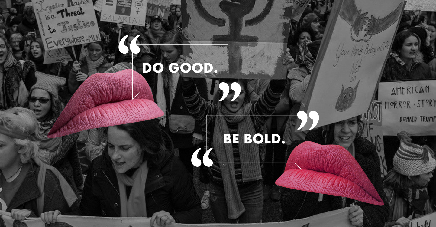
KPIs were being affected: Cart abandonment, conversion rates, and repurchase rates.
Overhaul site to include findings from user interviews, userflows, and quantitative data.
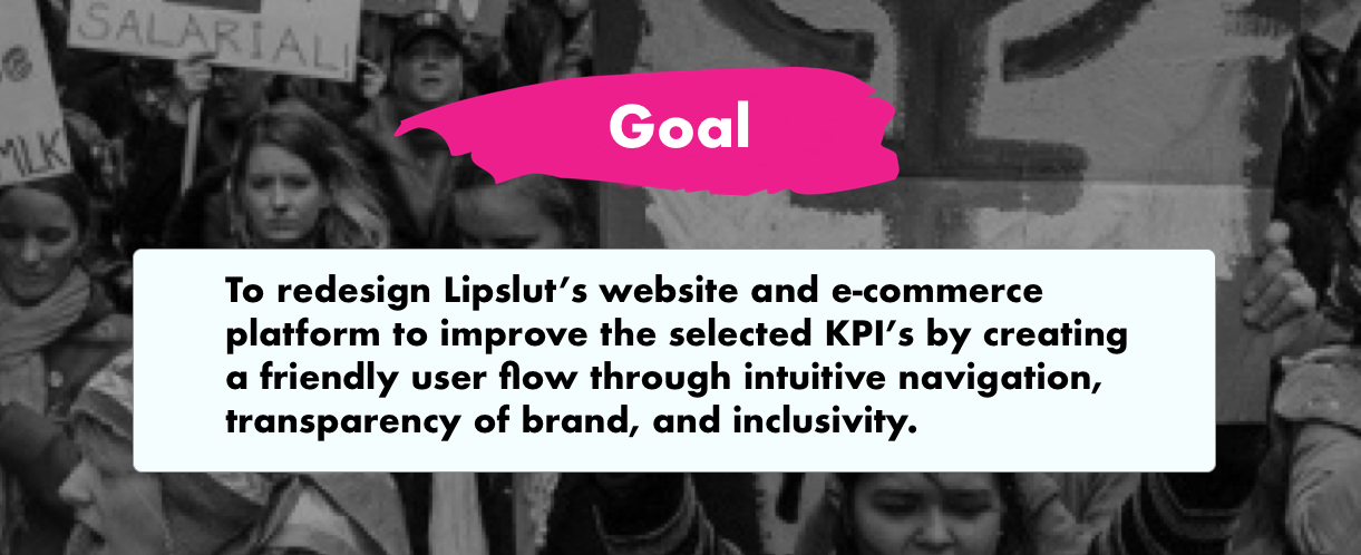
A newly designed site that is inclusive, transparent, and easy to navigate
Lipslut is a cosmetic brand that was birthed in the aftermath of the 2016 election. Their goal as a company is to help empower people to “put their money where their mouth is” by providing lipsticks that are charitable upon purchase.
Our client came to us wanting to improve select KPIs: conversion rates, cart abandonment rates, and repurchase rates.
We had five main areas of focus in order to achieve our final product: research, analysis, interviews, user testing, redesign.
Research gave us initial insight into cause related marketing, cart abandonment, and community platform building. One of the most interesting things we learned was that the market for cause related goods was growing, and perhaps in the future, it may be beneficial for Lipslut to find a way to have men be more involved in their brand.
Our initial analysis as a design team gave us insight into what might be affecting our client’s KPIs. We analyzed the website for any points of friction while navigating the site. We also did a feature comparison of our client’s direct and indirect competitors.
User interview affinity mapping gave us insight into things like the online spending habits of users, specifically with cosmetics, users’ affiliation with political activism and social causes, daily makeup habits, and their relationship with lipstick. This affinity map informed our personas.
Userflow affinity mapping allowed us to see what a user’s perspective was while navigating the website. These tests would give us insight into features that we could add or improve in order to make a better user experience.
Our user interviews informed us of three kinds of Lipslut users. Shae was our most important user because she was born out of important social commentary from our users. Some of our findings from our user interviews were also corroborated with our C+C analysis.
Shae’s journey map was an amalgamation of our user flow testing of the current site. These tests heavily informed us of features that we should incorporate into the redesign.
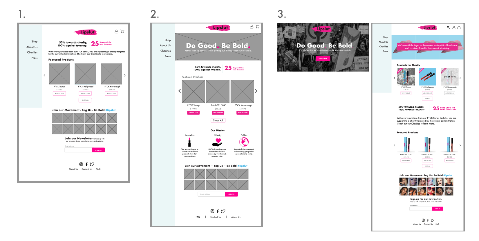
User testing revealed that many users were unaware that Lipslut sold more than two products. Because of this, navigation and visual hierarchy were the key elements of focus in the design studio.
Navigation was changed to reveal all products under one “shop” category.
Our designs and iterations were based on our user research and two design reviews with colleagues.
Most of these design problems all had to do with transparency and trust, and we believed that problems like these were directly related to the KPIs that they wanted to improve.
We had several important problems to solve in the redesign.
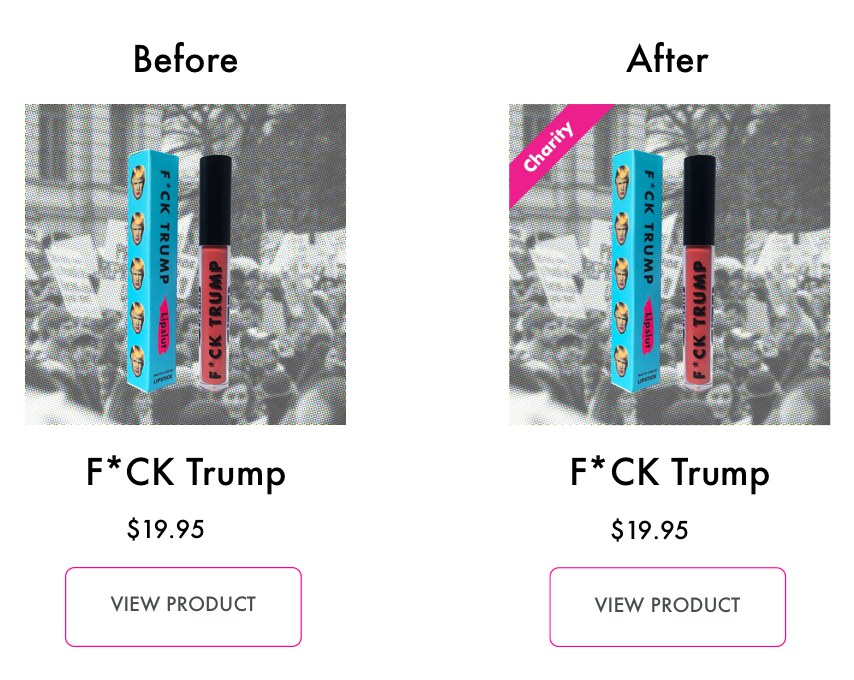
That is actually not the case. Only 3 lipsticks are charitable out of 8. Users who did find out that not all lipsticks were charitable were often confused and disappointed.
Our team deemed this a problem with their business practices aligning with their mission. We came up with a “charity” badge to make the issue as transparent to users as possible.
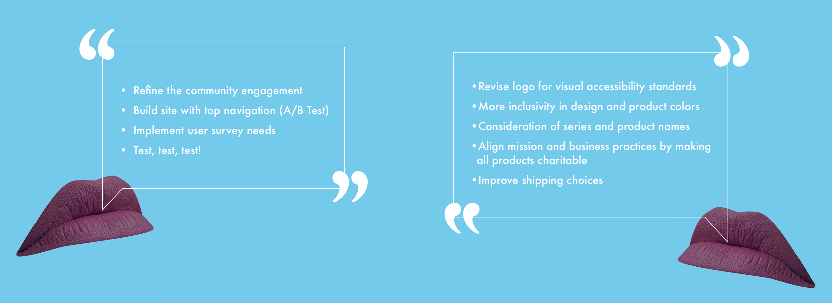
Ultimately we believed that the best way to approach this problem was out of our scope. The best way to fix the problem was to actually have all products be charitable, which is, in other words, to align the mission with business practices.
Because of their bottom line, not many companies are bold enough to pick a political side. Yet, Lipslut is fearless in empowering women to “put their money where their mouth is” and “vote with their dollar”.
However, we learned that the reason why they fell short of becoming a movement was due to inclusivity.
Inclusivity was my biggest lesson from this project. Users want to see some of themselves in a product and in a movement. People who feel under-represented are not going to wait around for you.